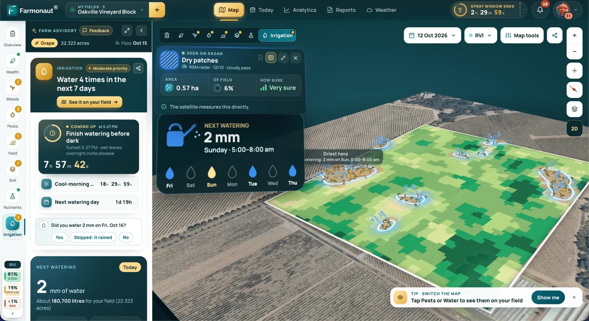

GIS Agriculture Mapping: What It Does and Real US Adoption Data
Reviewed August 2026 against USDA Economic Research Service (ARMS) and USDA Agricultural Research Service data.
Try it: Run your own numbers →
GIS mapping in agriculture is the practice of layering field boundaries, soil samples, yield data, satellite imagery, and weather records onto a single geospatial map so a grower can treat every part of a field differently instead of applying one blanket rate across the whole farm. That’s it — no more, no less. The gap between the idea and reality is adoption: USDA’s Economic Research Service found that in 2023, only 13% of small crop farms (gross cash farm income under $350,000) used yield monitors, yield maps, or soil maps, versus 68% of large-scale crop farms.1 This article covers what GIS agriculture mapping actually does, who is using it, what it costs in adoption terms, and how to check whether it’s worth it for your own acreage.
Table of Contents
- What GIS Agriculture Mapping Actually Means
- Who Is Using GIS Mapping in Agriculture — USDA Adoption Data
- The Core Map Layers: Soil, Boundaries, Yield, and Imagery
- The Technology Stack Behind GIS Agriculture Mapping
- What GIS Mapping Changes: Inputs, Yield, and Water
- Calculator: Estimate Your Input Savings from Precision Mapping
- How Farmonaut Fits Into a GIS Mapping Workflow
- Comparison Table: Adoption Rate by Farm Size and Technology
- FAQs: GIS Agriculture Mapping
- Where to Check Next Year’s Numbers
What GIS Agriculture Mapping Actually Means
GIS stands for geographic information system — software that stores data with a location attached, so every soil sample, yield reading, or satellite pixel is tied to a specific coordinate in the field. Mapping in agriculture takes that raw location-tagged data and turns it into a visual layer: a fertility map, a drainage map, a yield-history map. Stack several of those layers on top of each other over the same field boundary, and you get a decision tool — not just a picture. That stacking is what separates “gis mapping in agriculture” from a plain aerial photo.
- 🗺 Field boundary mapping: GPS-surveyed or satellite-digitized field edges that anchor every other layer and support compliance records.
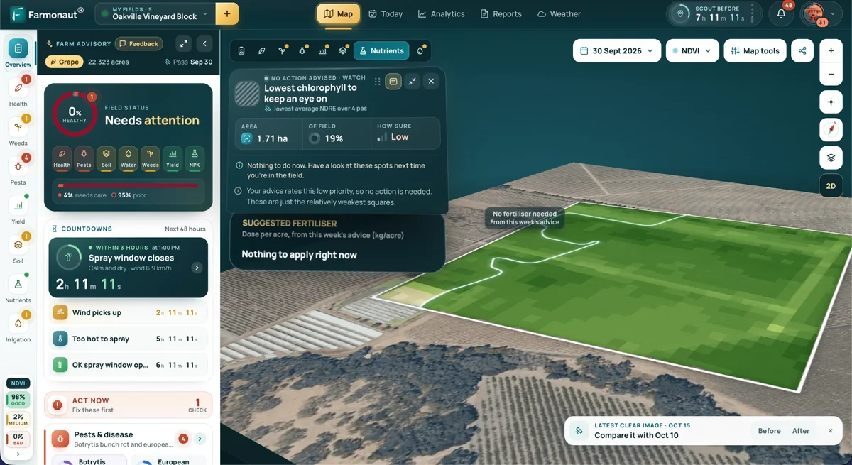
- 🧪 Soil mapping: Grid or zone soil samples showing pH, organic matter, texture, and nutrient levels across a field, not just at one point.
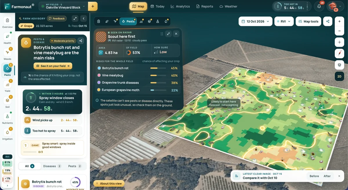
- 🛰️ Imagery mapping: Satellite, aircraft, or drone-based multispectral imagery used to spot crop stress before it’s visible on the ground.
- 📊 Yield mapping: Combine-mounted sensors that record yield at thousands of points per field, revealing which zones consistently under- or over-perform.
- 🎯 Variable-rate application (VRT): The output — machinery that changes seed, fertilizer, or water rate on the go, guided by the map stack above.
- Try it: Run your own numbers
A map that only shows where things are is cartography. A map that changes what a sprayer, planter, or irrigation pivot does at a given coordinate is GIS agriculture mapping. If your field data doesn’t feed back into an operating decision, you’re paying for the imagery without capturing the value.
Who Is Using GIS Mapping in Agriculture — USDA Adoption Data
The clearest public data on precision mapping adoption in US agriculture comes from USDA’s Agricultural Resource Management Survey (ARMS), summarized by the Economic Research Service. The pattern is consistent across every metric ERS tracks: adoption rises sharply with farm size. For yield monitors, yield maps, or soil maps specifically, 13% of small crop farms (GCFI under $350,000) reported use in 2023, compared with 68% of large-scale crop farms.1 That’s a 5.2x gap between the smallest and largest operations on the same technology category.
Guidance and autosteering systems — GPS-guided machinery that follows mapped paths rather than a driver’s eye — show a similar but less extreme split. USDA ARMS found 70% of large-scale crop farms used autosteering guidance in 2023, versus 52% of midsize farms.1 Autosteering doesn’t require a soil or yield map to function, which likely explains why the size gap is narrower here than for the mapping-dependent technologies above.
Aerial imagery — aircraft, drone, or satellite-based crop monitoring, the specific input that satellite platforms like Farmonaut provide — shows much lower overall adoption than ground-based mapping tools. USDA’s Agricultural Resource Management Survey found 7.0% of US corn acreage used aerial imagery in 2016, rising to 9.8% of soybean acreage by 2018.1 Those are the most recent commodity-specific figures ERS has published for aerial imagery use; if you need a current figure, USDA’s Cropland Data Layer program (see the refresh note below) tracks satellite-based land cover annually but does not itself report grower-level imagery adoption rates — for that, watch for the next ARMS-based ERS release.
If you farm between the small and large-scale thresholds ERS uses, you’re in the group where adoption is least documented and most variable — 52% used autosteering, but ERS does not break out a midsize-specific figure for yield/soil mapping the way it does for the small/large-scale endpoints. Treat the 13%–68% range as your likely bracket rather than a single benchmark.
The Core Map Layers: Soil, Boundaries, Yield, and Imagery
Soil Mapping: Where the Nutrient Numbers Come From
Soil mapping is grid or management-zone sampling — typically one sample point per 2.5 acres on a grid, or one per delineated zone — analyzed for pH, phosphorus, potassium, organic matter, and texture, then interpolated into a continuous surface across the field. This is the layer that tells a variable-rate spreader how much lime or phosphate to lay down at each point instead of a single farm-average rate.
- 🧬 Texture and structure: Determines water-holding capacity and root penetration — sandy zones and clay zones on the same field often need different seeding rates.
- 💧 Drainage and salinity: Flags zones needing tile drainage investment or a shift to more salt-tolerant hybrids.
- 🌱 Organic matter: The baseline figure used in soil carbon monitoring programs and in nitrogen mineralization estimates for fertilizer planning.
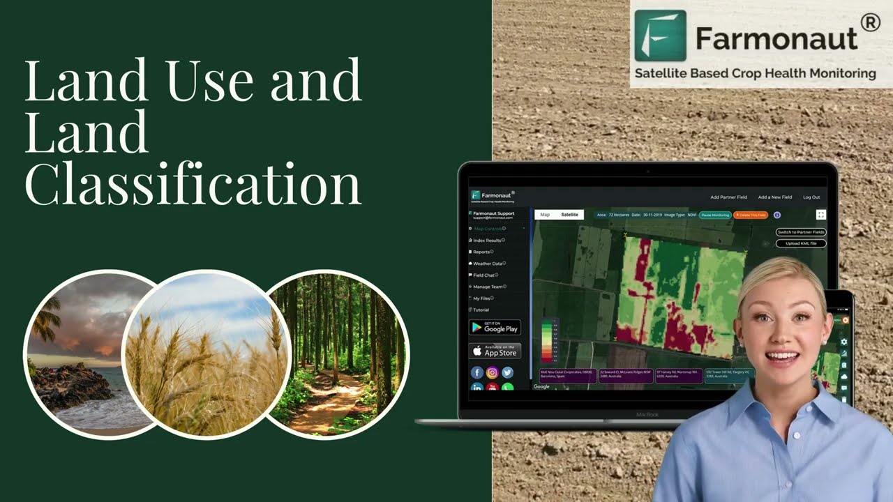
Sampling a field once every three to five years and treating that map as current. Nutrient levels shift with every harvest and every fertilizer pass — a soil map older than one full crop cycle is a starting point for re-sampling, not a rate-setting document.
Field Boundary and Yield Mapping: The Operational Layer
Field boundaries — GPS-surveyed polygons — are the base layer everything else snaps to. Yield maps come from combine-mounted flow and moisture sensors logging output every second or two, geo-tagged to sub-field coordinates. Overlaid across several harvests, a yield map stack shows which zones are consistently profitable and which consistently lag regardless of weather — the single most useful diagnostic a grower can build without buying new sensors, since most combines sold in the last two decades already carry the hardware.
- 🗺 Boundary mapping: Anchors legal compliance records and every subsequent data layer to the same coordinate system.
- 🎯 Zone delineation: Splits a field into 2–5 management zones based on multi-year yield stability, not a single season’s result.
- 🥇 Multi-year yield stacking: Distinguishes a weather-driven bad patch from a genuinely low-yielding zone that needs a different input strategy.

Satellite and Aerial Imagery Mapping
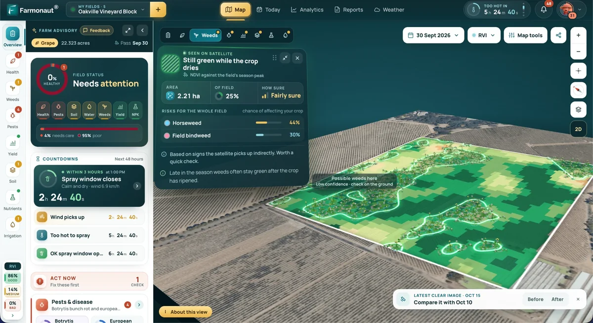
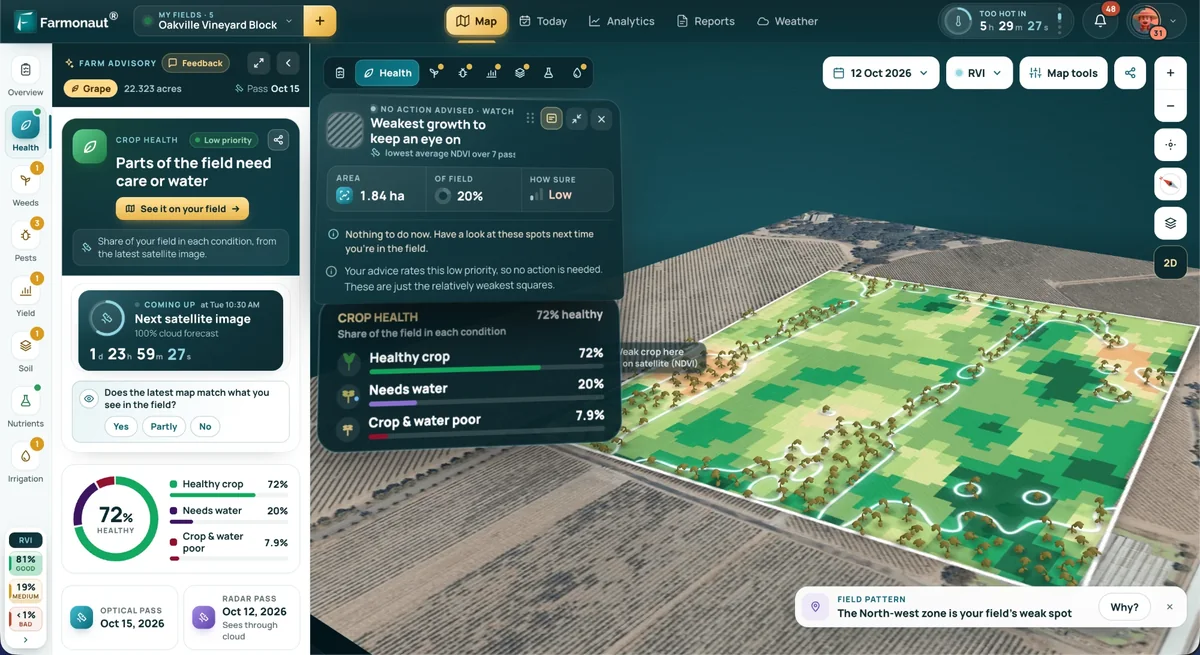
Multispectral imagery — from satellites, aircraft, or drones — adds a layer the other three can’t: what’s happening in-season, between soil samples and harvest. Vegetation indices built from near-infrared and red-band reflectance flag stress zones (moisture, pest, nutrient) days to weeks before they’re visible from the cab, which is the whole value case for a monitoring platform layered on top of the static soil and boundary maps.
USDA’s Agricultural Resource Management Survey put aerial imagery use at 7.0% of US corn acreage in 2016 and 9.8% of soybean acreage in 2018.1 Those are the two most recent commodity-level figures ERS has published for this specific technology — adoption may well be higher today, but there is no more recent USDA-published number for imagery specifically, as distinct from the broader precision-ag categories above.
The Technology Stack Behind GIS Agriculture Mapping
A working GIS mapping setup combines five layers of technology. None of them function as a decision tool in isolation — the value is in the stack, not any single piece.
- 🛰️ Satellite imagery: Multispectral and, increasingly, radar satellites provide repeat coverage without a flight booking — the baseline layer for anyone monitoring more acreage than they can walk weekly.
- 🚁 UAV/drones: Sub-meter resolution for ground-truthing a satellite-flagged stress zone or scouting a field between satellite passes.
- 🌐 GPS/GNSS receivers: The positioning layer underneath guidance autosteering, which 70% of large-scale US crop farms used in 2023.1
- 🤖 Analytics and machine learning: Classifies imagery into crop stress categories and forecasts yield from historical map stacks.
- ☁️ Cloud-based GIS platforms: Where the layers actually get stacked, queried, and turned into a variable-rate prescription file.
For anyone building or refreshing an adoption estimate, USDA NASS maintains the Cropland Data Layer, a 30-meter satellite-based land cover raster released each autumn — it’s the reference source for verifying acreage and crop classification claims, and it’s updated on a fixed annual cycle rather than ad hoc.



Explore satellite-based field mapping, crop health analysis, and soil monitoring directly via the Farmonaut Web App and dedicated mobile apps.
What GIS Mapping Changes: Inputs, Yield, and Water
USDA’s Agricultural Research Service compiles the return ranges most commonly cited in peer-reviewed precision agriculture literature. Three figures are worth naming precisely rather than waving at: a typical yield increase of 6% from precision agriculture technologies, a 10–20% reduction in fertilizer input, and a 15–30% reduction in water use.2 These are ranges from published research USDA-ARS aggregates, not guarantees for any specific field — the input reduction you see depends on how uneven your field’s baseline fertility and moisture already are; a highly uniform field has less to gain from variable-rate mapping than a field with sharp zone-to-zone differences.
The 10–20% fertilizer reduction and 15–30% water reduction are the outer bounds reported across the studies USDA-ARS reviewed, not an average you should expect on your first season. A field with well-documented zone variability (from a multi-year yield map, as described above) sits closer to the top of the range; a field mapped for the first time with a single soil test typically sits lower until a second season of data refines the zones.
Integrated map stacks — soil, boundary, yield, and imagery layers combined — also support carbon footprinting, since organic matter and land-use records feeding a GIS platform are the same records used to document a carbon sequestration claim. For operations using satellite-verified field data as loan or insurance collateral, that same map stack underpins Farmonaut’s crop loan and insurance solutions.
Calculator: Estimate Your Input Savings from Precision Mapping
Use the USDA-ARS reduction ranges above against your own acreage and current input spend to get a field-specific savings estimate — not a national average.
Run your own numbers
Assumptions: applies USDA-ARS’s reported ranges of 10–20% fertilizer reduction and 15–30% water use reduction from precision agriculture technologies, scaled by how much zone-to-zone variability you tell it your field has. It does not include mapping equipment, software subscription, or agronomist costs, and it does not model yield gains — only input cost reduction. Treat the output as a planning estimate, not a guaranteed figure for your farm.
How Farmonaut Fits Into a GIS Mapping Workflow
Farmonaut provides the satellite imagery and analytics layer of the map stack described above — the piece USDA data shows has the lowest adoption (7.0%–9.8% of surveyed acreage as of 2016–2018) relative to ground-based mapping tools, and therefore the most room for a grower to add value cheaply, since it requires no new field hardware.
- 🌟 Satellite-based crop and soil health mapping: Field-level vegetation index tracking layered onto your existing boundary and soil maps.
- 🔥 Jeevn AI advisory: Site-specific recommendations for irrigation, fertilization, and pest risk based on the mapped data.
- 🔗 Product traceability: Blockchain-based supply chain records tied to the same field-level map data — see traceability solutions.
- 🚜 Fleet and resource management: Coordinates machinery against the same field boundary and zone maps via a dedicated management platform.
Access is available via web, Android, and iOS, plus full API access through the API Portal and developer documentation for teams building mapping data into an existing farm management system.
Farmonaut’s API (see details) lets developers integrate satellite mapping data directly into an existing farm management dashboard or a GIS platform already in use, rather than requiring a standalone tool.
Comparison Table: Adoption Rate by Farm Size and Technology
This table consolidates every USDA ARMS figure cited in this article into one reference. All figures are from the 2023 survey year unless noted, via USDA Economic Research Service.
| Technology | Small Farms (GCFI <$350k) | Midsize Farms | Large-Scale Farms | Survey Year |
|---|---|---|---|---|
| Yield monitors, yield maps, or soil maps | 13% | Not separately reported | 68% | 2023 |
| Guidance autosteering systems | Not separately reported | 52% | 70% | 2023 |
| Aerial imagery (corn acreage) | 7.0% of surveyed US corn acreage | 2016 | ||
| Aerial imagery (soybean acreage) | 9.8% of surveyed US soybean acreage | 2018 | ||
Source: USDA Economic Research Service, precision agriculture adoption data. Where a cell is marked “not separately reported,” ERS’s public 2023 ARMS summary did not break that farm-size category out for that specific technology — it is a genuine gap in the published data, not an omission on our part.
FAQs: GIS Agriculture Mapping
What is GIS mapping in agriculture?
It’s the use of a geographic information system to layer field boundaries, soil sample data, yield records, and satellite or drone imagery over the same coordinate space, producing maps that can drive variable-rate seeding, fertilizing, or irrigation decisions rather than a single farm-wide rate.
How many US farms actually use GIS or mapping-based precision agriculture?
USDA’s Economic Research Service found that in 2023, 13% of small crop farms (GCFI under $350,000) used yield monitors, yield maps, or soil maps, compared with 68% of large-scale crop farms — a gap that holds across most precision technologies ERS tracks. USDA does not publish a single “GIS adoption” figure; it reports adoption by specific technology (yield mapping, guidance autosteering, aerial imagery) instead.
Does GIS mapping in agriculture actually reduce input costs?
USDA’s Agricultural Research Service cites typical ranges of 10–20% lower fertilizer use and 15–30% lower water use from precision agriculture technologies, alongside an average 6% yield increase, based on peer-reviewed research it has compiled. Actual results depend on how much soil and yield variability exists within your own field.
What’s the difference between GIS mapping and satellite crop monitoring?
Satellite crop monitoring is one input layer — imagery — feeding into a GIS map stack that also includes soil samples, field boundaries, and yield history. USDA ARMS data show aerial imagery (aircraft, drone, or satellite) is used on a smaller share of surveyed acreage (7.0% of corn in 2016, 9.8% of soybeans in 2018) than ground-based mapping tools like yield monitors, suggesting imagery is the layer with the most room to add value on an already-mapped farm.
How current is USDA’s precision agriculture adoption data?
The farm-size adoption figures cited in this article are from the 2023 Agricultural Resource Management Survey, the most recent year USDA’s Economic Research Service has published as of this review. 2024–2025 figures have not yet been released; check the ERS publication page linked above for the next update.
Where to Check Next Year’s Numbers
The adoption gap this article documents — 13% of small farms versus 68% of large-scale farms using yield or soil mapping, per USDA’s 2023 ARMS data1 — is the actual state of GIS agriculture mapping in the United States, not a projection. That gap is also the durable part of this story: whatever the next survey shows, the direction (adoption scales with farm size, and imagery lags ground-based tools) is unlikely to reverse, even as the specific percentages move.
To verify these figures are still current, check USDA’s Economic Research Service publication page (linked above) for a newer ARMS-based release, and check USDA NASS’s Cropland Data Layer page for the most recent autumn’s 30-meter land cover raster if you need current acreage or crop classification data rather than adoption rates.
Explore Farmonaut’s large scale farm management and crop plantation and advisory tools to put a satellite imagery layer on top of your existing field boundary and soil maps.
1 USDA Economic Research Service, “Precision Agriculture in the Digital Era” (2023 ARMS data). 2 USDA Agricultural Research Service, benefits and evolution of precision agriculture. Cropland classification and acreage data: USDA NASS Cropland Data Layer FAQ.
Discussion
Questions, corrections or field experience? Share them below. First-time comments are reviewed before they appear, and your email is never published.
No comments yet. Be the first to add a question or your experience.

 Ascentya
 CU Foods
 BeyondTech Global
 Rouge VC
 Yutz Automation
 AgroGreen Dynamics
 AgroRisk
 Oath Inc
 Reddane Farming
 Esri North East Africa
 Cresol
 Atur Kuliner
 MDCV UK
 Zerella Group
 Etech Consulting Madagascar
 Vestlandsforsking
 Delicio
 WB Dev
 Sama Premium
 Prochecker
 Tres Valles
 LACOS Geoinformation
 Magrifly
 LatConnect 60
 Exploration consultancy · South Africa · Gold
 Licence holder · Niger · Gold